Living Room
Blue Sofa Living Room Ideas That Balance Shade, Scale, and Warm Contrast
Blue sofa living room ideas for navy, slate blue, teal, deep blue, soft blue, and indigo sofas—using shade, scale, warm contrast, and circulation to keep the sofa visually clear.
A blue sofa can sharpen a traditional room, settle quietly into Scandinavian daylight, or act almost like a sculptural color field in a spare interior. The shade matters, but so do the sofa’s silhouette, scale, and the amount of light around it. Navy needs enough pale architecture to remain visibly blue rather than reading black. Slate blue needs warm companions that keep it from flattening into gray. Teal, deep blue, soft blue, and indigo each ask for a different balance of warm and cool surfaces.
The strongest blue sofa living room ideas make those differences easy to read. Warm wood, cream textiles, tan, rust, glass, pale stone, and open floor can all clarify the sofa without turning the room into a themed blue scheme. The six sections below keep the sofa as the hero while using contrast and circulation to control how much visual weight the color carries.
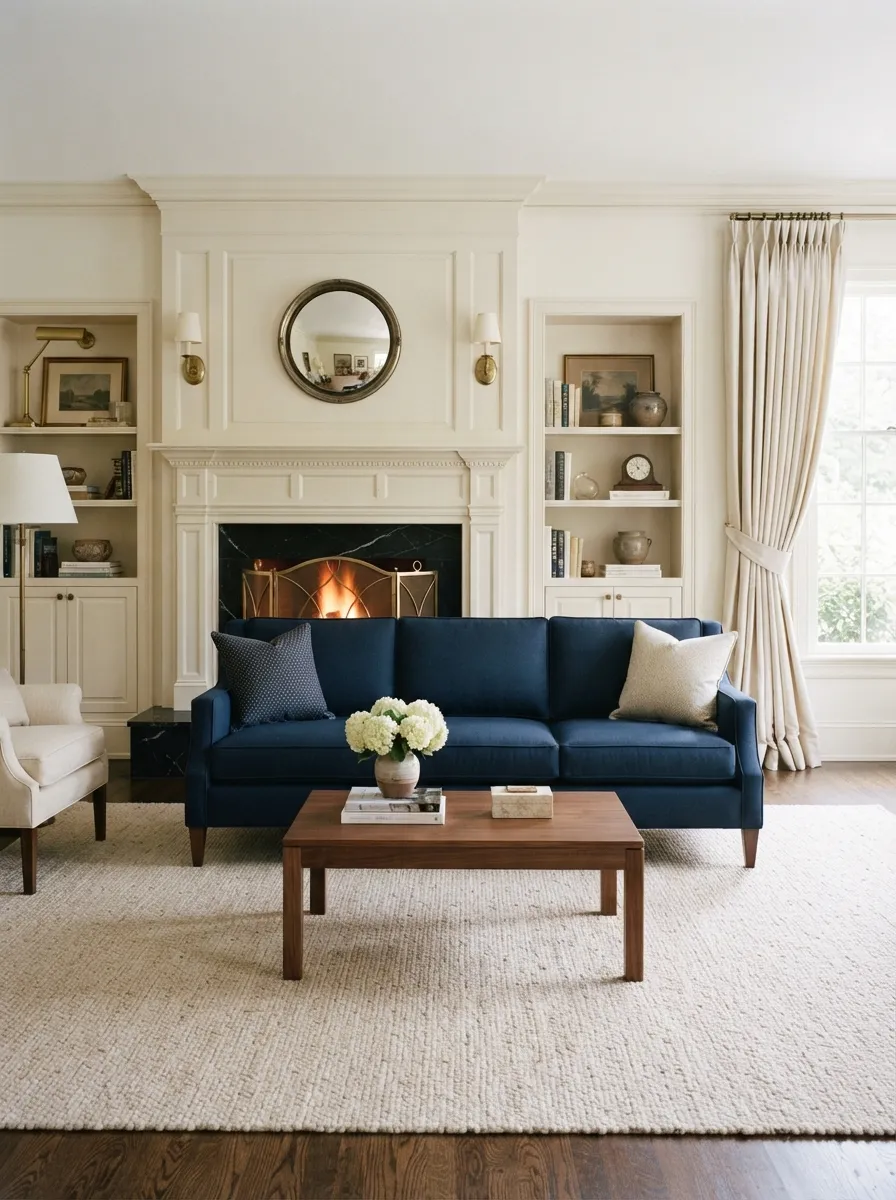
1. Keep a tailored navy sofa clearly blue in a classic fireplace room
A tailored navy sofa gives a white fireplace room a strong horizontal anchor without disturbing the room’s symmetry. The visible arms and legs matter because they break up the dark mass and keep the sofa from becoming a single low block in front of the hearth.
White architecture, cream drapery, and a pale rug create the light boundary that lets navy remain clearly blue rather than drifting toward black or charcoal. A walnut-toned table provides the dominant warm counterpoint at the center of the room and keeps the palette from becoming only blue and white.
The useful lesson is the relationship between shade and silhouette. A broader lounge profile would spread more blue across the fireplace zone, while the tailored outline leaves more breathing room around the base. The image can support those visible proportions and color relationships, but exact upholstery, cushion construction, dimensions, and other hidden product details require merchant verification.
2. Let slate blue soften in Scandinavian daylight
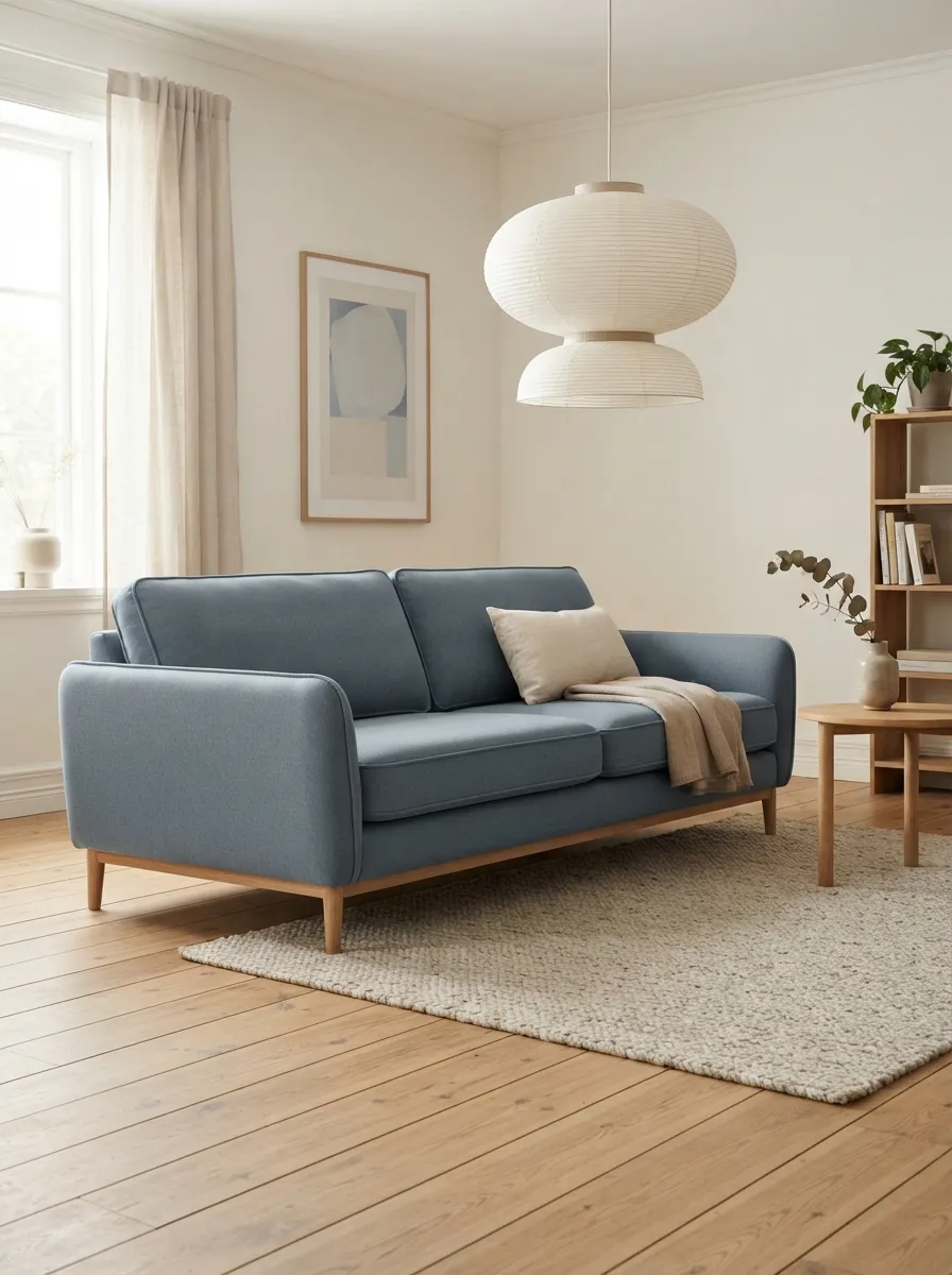
Slate blue becomes calmer when it sits beside blond wood, warm white, and oatmeal instead of cold gray. Broad daylight keeps the room pale, while the sofa introduces enough muted color to remain distinct from the floor and walls.
The important distinction is that slate blue should still read as blue. It may look quieter in bright daylight, but warm whites and pale wood prevent the shade from becoming generic gray. There is no need to push the scene toward icy cyan; the appeal comes from a softened blue sitting inside a warm, light Scandinavian palette.
Visible surface appearance can change how the shade reads. A more textured-looking surface may make the room feel relaxed, while a smoother-looking face can make the same color seem more tailored. Those are appearance cues only. Exact fiber composition, performance, care, and construction belong to the merchant listing.
3. Use teal sectional geometry with warm contrast
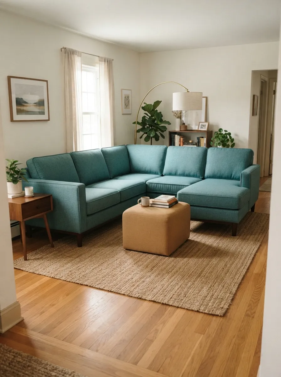
Teal sits between blue and green, so the supporting palette needs to keep that blue-green identity legible. A camel-toned ottoman and warm tan rug provide the main warm contrast, helping the sectional feel intentional rather than simply dark or saturated.
The sectional shape matters as much as the color because it turns teal into a large room-shaping surface. The approach path should remain visible around the grouping, and the ottoman should feel connected to the seating without closing off circulation. That relationship is what makes the room readable from the entry.
Keep the ottoman description limited to visible color and form unless merchant data supports more. The image can show apparent visual mass, chaise direction, and spacing, but it cannot establish exact module boundaries, comfort, dimensions, construction, or upholstery specification.
4. Ground deep blue with walnut-toned wood and restrained rust
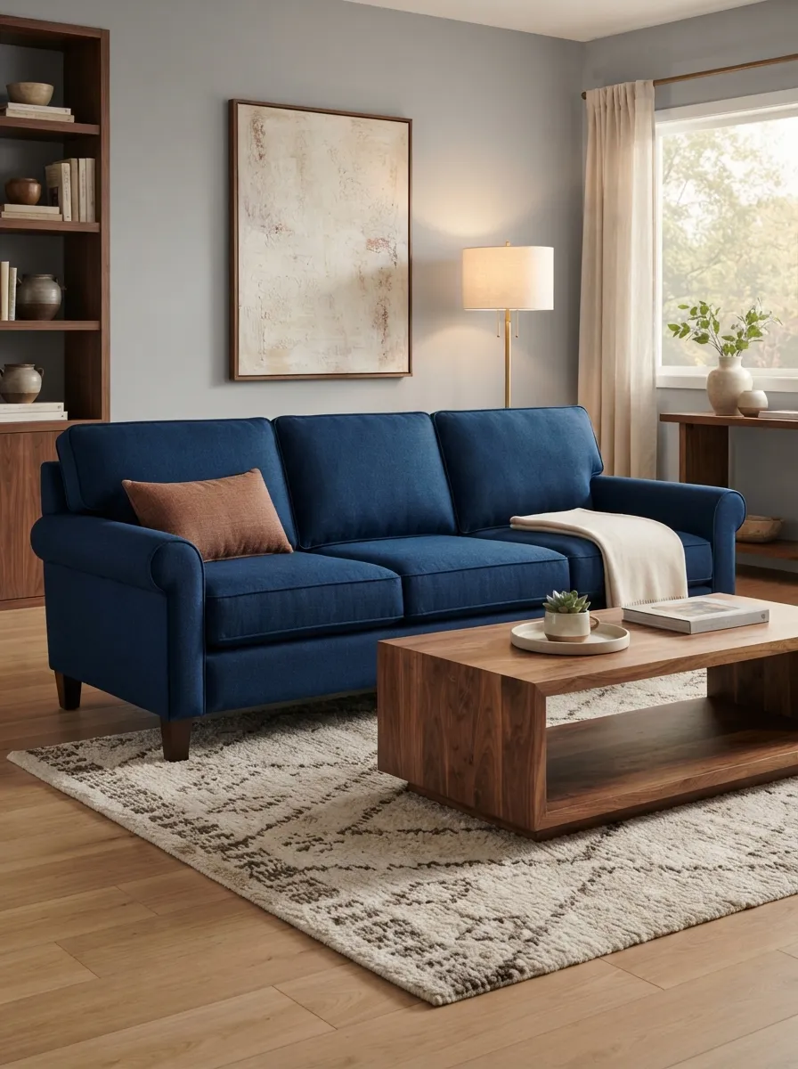
Deep blue feels warmer and more grounded when one clearly visible brown surface carries the counterpoint. A walnut-toned coffee table does more work than a scattering of small brown accessories because its warm plane remains easy to read beside the sofa.
Restrained rust accents extend that warmth without overtaking the room. Cream in the rug gives the sofa a lighter boundary at floor level, while soft gray walls keep the composition controlled. The result should feel earthy and balanced rather than nautical; blue-and-white patterning is not the organizing idea here.
The editorial value is the temperature relationship: deep blue as the cool hero, one dominant warm wood plane, and smaller rust notes around it. The image supports visible color and material appearance, not an exact wood species or hidden product construction.
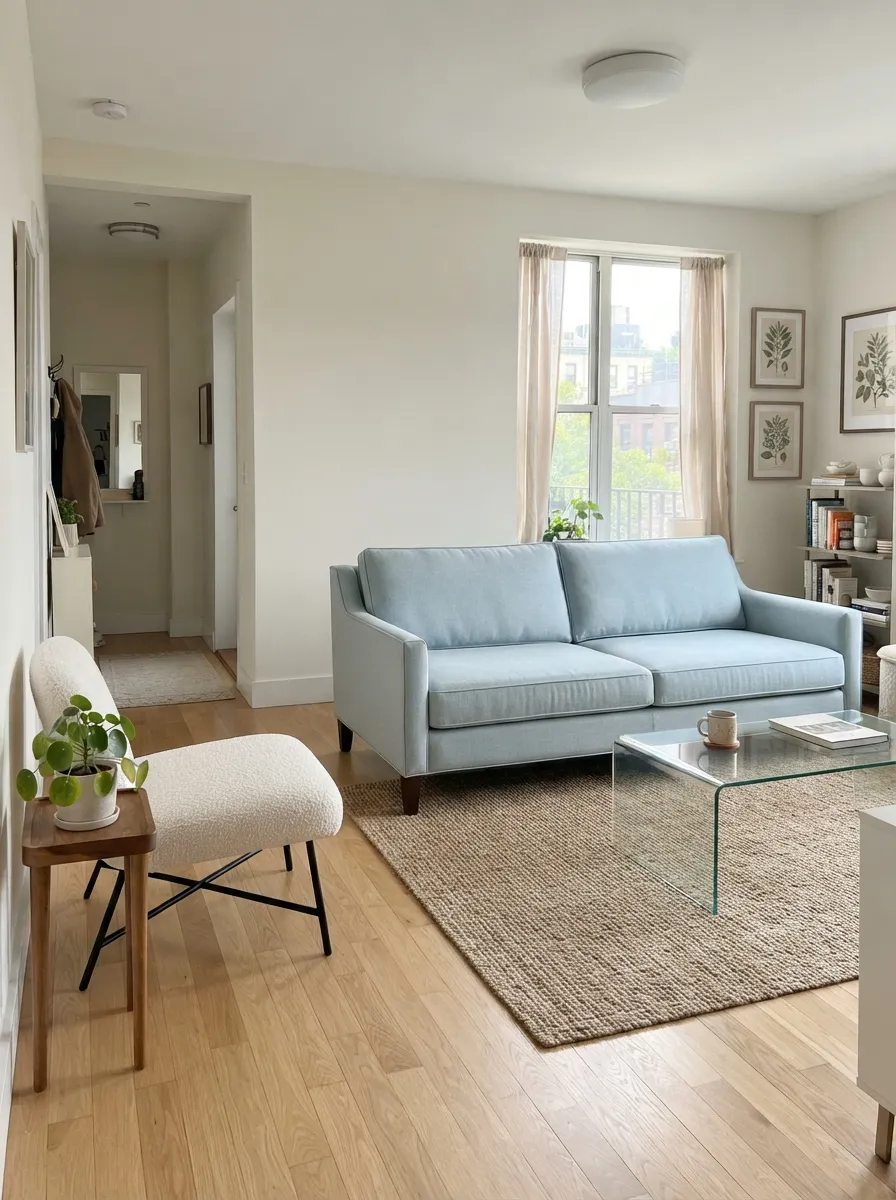
5. Keep a soft blue sofa visually light in a small apartment
A pale soft-blue sofa can add more personality than gray without making a small apartment feel visually heavy, provided the silhouette stays disciplined. Narrow arms help the seating read as compact, while a glass table leaves the center of the room visually open.
The entry view is the key test. Visible floor, a clear walking path, and a transparent center table allow the eye to move through the room instead of stopping at a dense cluster of furniture. A warm neutral rug provides warm contrast without competing with the pale blue.
Soft blue should remain visibly blue rather than being relabeled gray simply because its value is light. The image can establish narrow-arm appearance and proportional openness, but exact sofa dimensions, delivery clearances, construction, and performance still need merchant verification.
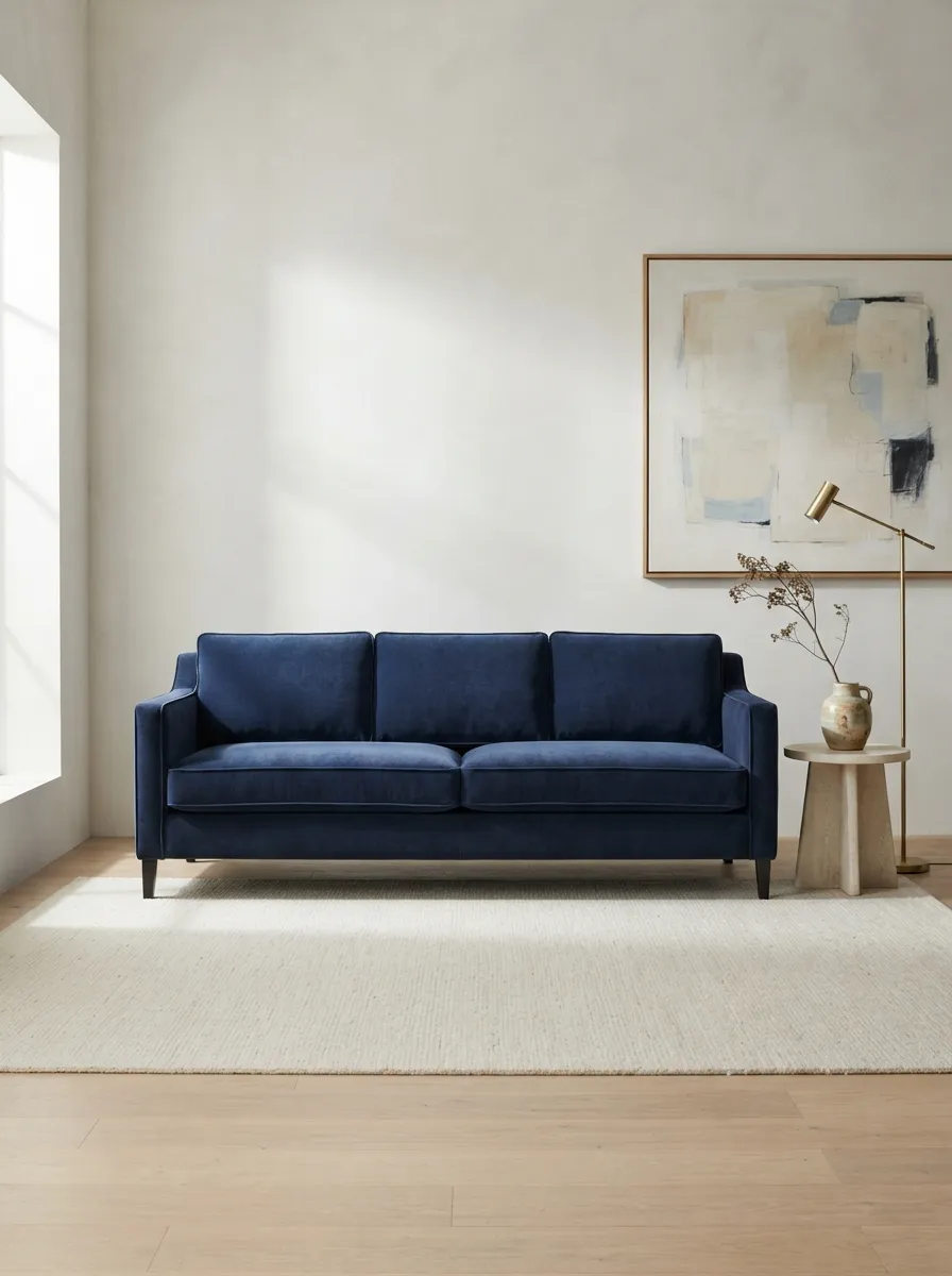
6. Let deep indigo act as the focal point in a gallery-like room
Deep indigo has enough density to behave almost like a sculptural object when the surrounding architecture stays pale and restrained. Pale stone, a cream rug, restrained brass, and abstract art give the sofa visual space while keeping the room from becoming dark.
Indigo should remain clearly within the blue family rather than being pushed toward purple or black. Directional light may reveal velvet-like depth or a restrained light response across the surface, but that visible appearance is not proof of fiber composition or performance.
Keep the surrounding forms few and deliberate. The pale architecture should remain the larger quiet field, while stone, brass, and art support rather than compete with the sofa. The room works because the indigo is allowed to remain the strongest saturated surface.
Choose the blue shade before building the supporting palette
Navy, slate blue, teal, deep blue, soft blue, and indigo do not behave the same way in a room. Navy benefits from white and cream that keep its darkness readable. Slate blue works with warm Scandinavian neutrals. Teal becomes clearer beside tan and camel-toned contrast. Deep blue gains warmth from brown wood and rust. Soft blue needs just enough edge to avoid fading into a small room, while indigo benefits from pale architecture and restrained objects.
That shade choice should lead the supporting palette. The goal is not to repeat blue everywhere, but to give the sofa the right temperature relationship so its specific color remains understandable.
Let silhouette, scale, and circulation control visual weight
A dark blue sofa can feel heavier than a pale one even when their physical sizes are similar. A sectional spreads color across a broader portion of the room, while narrow arms and visible legs can reduce the sense of mass around a smaller sofa.
That is why circulation remains part of color planning. Visible floor, a clear approach path, a transparent table, pale architecture, or a separate warm accent can all reduce visual weight without weakening the sofa as the hero.
Use inspiration images to judge shade, visible surface appearance, silhouette, scale, contrast, light behavior, furniture relationships, and circulation. Exact materials, construction, care, dimensions, warranty, and availability should be verified directly with the merchant rather than inferred from an image.
A blue sofa works best when its shade stays specific, its silhouette suits the room, and the supporting palette gives it enough contrast to remain visually clear.